How much traffic does Black Friday bring?
Across the 138 retailers that Queue-it tracked in 2025, Black Friday drew 77.5 million web visits, 78% more than an average October Friday. That is the market answer to how much traffic Black Friday brings. Your store’s answer can be very different, and it is the only one a load test can use.
Market figures show the scale but hide the shape. Shopify’s network peaked at 489 million requests per minute on its edge during Black Friday Cyber Monday 2025, and its busiest minute of sales came at 12:01 pm Eastern time, one minute past the hour, which is the shape a timed launch or email send produces. Adobe forecasts Black Friday 2026 online spending in the US at 12.9 billion dollars, up 9.2% on 2025.
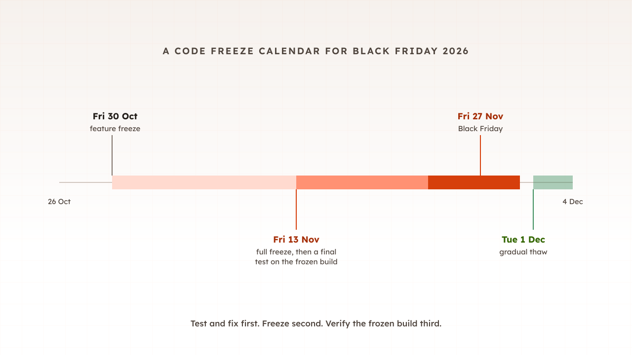
None of those numbers tells you how many people will be on your site at 08:03 on 27 November. Your own analytics can, because last year’s peak already happened on your site, with your customers, your email list and your discounts. This guide turns that history into a load test target in six steps, using one example store throughout.
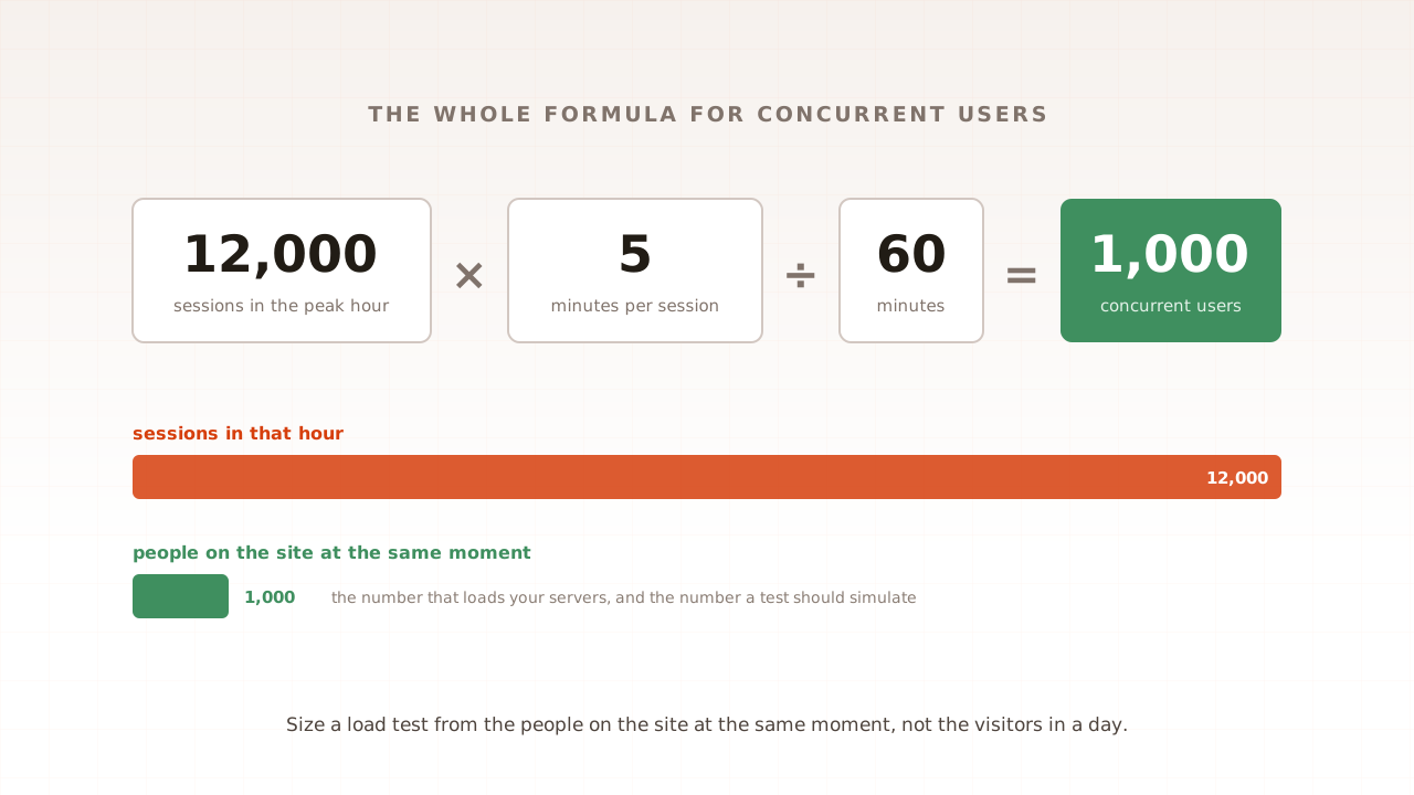
The method assumes you know what a concurrent user is and how the basic formula works. If not, part 7 of this guide covers concurrent users in five minutes and is worth reading first. The countdown that this target feeds is in part 1, the Black Friday readiness plan.
What you need before starting
Gather these before you open any reports. Each one feeds a later step.
- Analytics access for last year’s peak week. Google Analytics 4 or your platform’s own analytics, with editor access so you can check the retention setting.
- Server or CDN logs for last year’s peak day, or someone who can query them. They give you the minute-by-minute shape that analytics does not.
- Order data by hour from your ecommerce platform or order database. Order records are kept long after analytics detail is deleted, so they are your cross-check.
- This year’s promotion plan: when emails go out, how big the discounts are, and whether the list or the advertising budget has grown.
- A spreadsheet. Every step adds one line, and the last line is your target.
The example store is a homeware retailer that sent its main Black Friday email at 08:00 on 28 November 2025. Its numbers are illustrative, chosen to make the arithmetic easy to follow.
Step 1: Check that your analytics still reaches last November
Before looking for the peak, make sure the data still exists. In Google Analytics 4, properties retain two months of data by default, and Google’s documentation says the data retention setting only affects explorations and funnel reports. Standard reports keep their totals, but the hour-level analysis in Step 2 is an exploration.
So by October, a property left on the default cannot show last Black Friday in Explorations. Check the setting in Admin, in the property’s data settings, under Data retention.
If it says two months, do two things today:
- Change it to 14 months, the longest option for a standard property. Google notes that a longer setting applies to data you have already collected and not yet deleted, so this protects this year’s peak for next year’s planning. It does not bring back what has gone.
- Rebuild last year’s peak from other sources. Your order data holds the busiest hour, because order records outlive analytics detail. Divide orders in each hour by that day’s conversion rate from the standard reports and you have an estimate of sessions per hour. Server or CDN logs, if you kept them, give the same answer more directly.
You know this step worked when an exploration with a date range covering last Black Friday returns rows, or when you have an hourly sessions estimate from orders.
Step 2: Find last year’s busiest hour
Open Explore, start a free-form exploration, and set the date range to the week around last year’s peak, 24 to 30 November 2025 in the example. Add one dimension and two metrics:
- Rows: Date + hour, which Google defines as the date and hour when an event was collected, formatted as YYYYMMDDHH
- Values: Sessions and Average session duration
Sort by sessions, highest first. The top row is your busiest hour. A one-week range keeps the query small, which matters because explorations may be based on sampled data if more than 10 million events are part of a query.
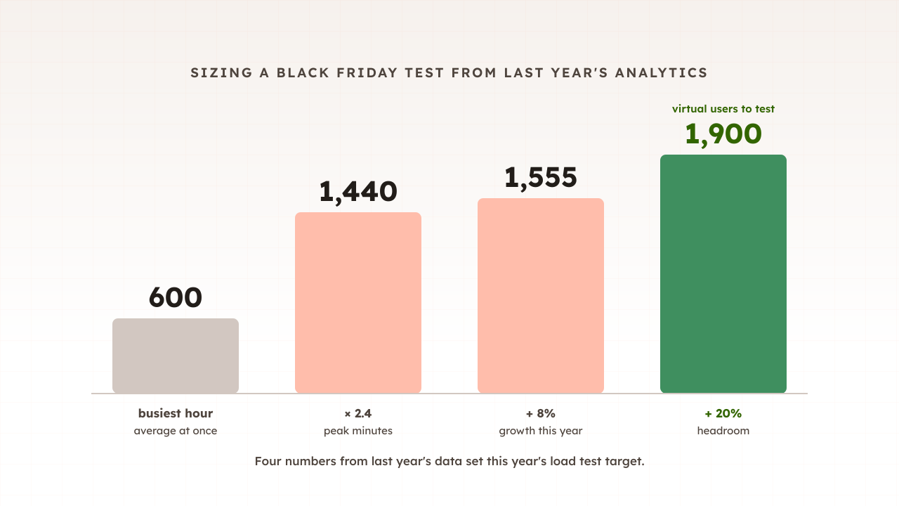
The example store’s top row reads 2025112808: 9,000 sessions between 08:00 and 09:00 on Black Friday, with an average session duration of 4 minutes. Its concurrent users for that hour come from the formula in part 7: 9,000 sessions multiplied by 4 minutes, divided by 60, gives 600 people on the site at the same moment, averaged across the hour.
Write down one more number from the same hour: orders. The store took 171 orders between 08:00 and 09:00, a conversion rate of 1.9%. You will use it in Step 6.
You know this step worked when you have three numbers for one specific hour: sessions, average session length and orders.
Step 3: Find the busiest minutes inside that hour
An hourly figure is an average, and peak trading is not evenly spread across an hour. GetResponse’s analysis of 4.4 billion emails found that the first hour after sending captures 21.20% of opens and 44.14% of clicks. When a big send lands, the first minutes after it are the busiest of the day.
The gap between sending and buying can be hours rather than minutes. Klaviyo reports that on Black Friday 2024 its customers’ most active sending hour was 9 to 10 am Eastern time, while peak order volume came shortly after, from noon to 1 pm. Browsing peaks and checkout peaks do not always land in the same minute, which is why Step 6 treats them as separate journeys.
Analytics will not show you the minutes. The standard time dimensions stop at the hour; the Analytics Data API has a Date hour and minute dimension and the BigQuery export timestamps every event, but most teams get there faster with logs. Count requests for HTML pages, not images or scripts, in each minute of the busiest hour, after removing obvious bots (Step 5 covers how).
Each person on the site requests pages at roughly the same pace, so page requests per minute rise and fall with the number of people present. That makes the ratio between the busiest minutes and the hour’s average a fair multiplier for concurrency.
The example store’s CDN logs show an average of 2,000 page requests per minute across the hour, and 4,800 per minute between 08:00 and 08:10, straight after the email. The peak factor is 4,800 divided by 2,000, which is 2.4. Peak concurrency is 600 multiplied by 2.4: 1,440 people at once in the first ten minutes.
If you cannot get minute-level data at all, treat the hourly figure as the floor, not the target, and let the capacity test find how far above it the site can go.
Step 4: Scale last year’s peak to this year
Last year’s peak is a baseline. This year’s will differ, and the national forecasts will not tell you by how much. Adobe expects US online spending to grow 9.2% on Black Friday, while IMRG forecast that the total UK online market would see year-on-year growth of 0% in 2026. Your own trend is a better guide than either.
Compare your last four complete weeks of sessions with the same four weeks a year earlier. Go back 364 days rather than a calendar year so that the weekdays line up. Then adjust for anything in the promotion plan that differs from last year: a larger email list, a deeper discount, a new advertising channel, or an earlier start.
The example store’s last four weeks are 8% up on the same weeks of 2025, and its discount and email plan match last year’s. So the peak scales from 1,440 to 1,555.
Then add headroom for what the trend cannot see. Part 1’s plan uses 20 to 50 percent, with the higher end when discounts or advertising are heavier than last year. Because the store has already applied its measured growth and its promotion is unchanged, it takes the low end: 1,555 plus 20 percent is 1,866, which it rounds up to a target of 1,900.
You know this step worked when you can explain every multiplier in one sentence to someone outside the team.
Step 5: Separate people from bots
Analytics and logs disagree about bots, and the disagreement matters. In Google Analytics, traffic from known bots and spiders is automatically excluded, and you cannot see how much was excluded. Your server and CDN logs keep every request, from people and machines alike.
The machines are not a rounding error. Imperva’s 2026 report found that automated traffic made up more than 53% of all web traffic in 2025, and Queue-it found that 28% of all Cyber Five requests came from a bot or a data centre in 2025, down from 36% in 2024.
That gives each source a job:
- Use analytics to count people. The 9,000 sessions in Step 2 are mostly human, which is what virtual users simulate.
- Use logs for the shape of the hour, after filtering out known crawlers and the bot categories your CDN flags. Bots that run steadily all hour would flatten your peak factor if you left them in.
- Keep capacity for the machines. Bots still consume server time on the day, so the headroom from Step 4 is partly there for them.
There is a second gap in the opposite direction. In the UK and the EU, visitors who refuse analytics cookies may not appear in Google Analytics at all. If your analytics sessions look low next to your orders, trust the orders and scale up.
Step 6: Turn the peak into virtual users and journeys
A virtual user is one simulated visitor, so the example store’s target is 1,900 virtual users. The next question is what they do, because 1,900 people reading product pages load a site very differently from 1,900 people paying.
Take the journey mix from your own funnel for the busiest hour. The example store’s 9,000 sessions break down like this:
| Journey | Share of peak-hour sessions | Virtual users at 1,900 |
|---|---|---|
| Browse: home, category, search and product pages | 91% | 1,729 |
| Basket: add to cart, then leave | 5.5% | 105 |
| Checkout: through to the payment step | 3.5% | 66 |
For a sense of normal levels, Littledata’s benchmark of 421 Shopify stores over the summer of 2026 reports a median add-to-cart rate of 6.5% and a median conversion rate of 1.4%. Peak days do not follow summer averages, so use your own.
Then convert orders into a checkout target. The store took 171 orders in its busiest hour, about 2.9 a minute. Scaled by the same factors as traffic, 2.4 for the peak minutes, 8% for growth and 20% for headroom, checkout has to complete about 9 orders a minute. That number is worth checking with your payment provider as well as your own servers.
Run the mixed test at these weights first. Then consider a second run that over-weights checkout, because checkout pages are rarely cached and usually hit the database hardest. Part 6 covers how to run the test itself, and the opening surge is the subject of spike testing.
How do you know the estimate is right?
You know the estimate is sound when three independent numbers agree: analytics sessions, order data, and log traffic. Each step above produced a figure you can cross-check against another source, and a target that survives the cross-checks is one you can defend in a planning meeting.
Run these checks before you book the test:
- Orders against sessions. Sessions in the busiest hour multiplied by the conversion rate should land close to the orders your platform recorded for that hour. A large gap points to consent losses or tracking problems.
- The target against last year. The new target should be well above last year’s hour-average concurrency. The example store’s 1,900 is about three times its 600, which matches the stacking of peak minutes, growth and headroom.
- The test against the logs. When the test runs, its page requests per minute should approach the projected peak: 4,800 multiplied by 1.08 and 1.2, about 6,200 a minute for the example store. If the test produces far fewer, your virtual users are pausing longer between pages than real shoppers do.
The whole estimate fits on one sheet:
| Line | Example store | Where it came from |
|---|---|---|
| Busiest hour sessions | 9,000 | GA4 exploration, Date + hour |
| Average session length | 4 minutes | Same exploration |
| Hour-average concurrent users | 600 | 9,000 × 4 ÷ 60 |
| Peak factor | 2.4 | Logs, busiest ten minutes against the hour |
| Peak concurrent users | 1,440 | 600 × 2.4 |
| Growth | +8% | Last four weeks against the same weeks of 2025 |
| Headroom | +20% | Low end of the 20 to 50 percent band |
| Load test target | 1,900 virtual users | 1,440 × 1.08 × 1.2, rounded up |
Common problems and fixes
Most estimates fail in one of five ways. The symptom usually shows up as a target that feels too small, or as a test that passes while the real day struggles.
| Symptom | Likely cause | Fix |
|---|---|---|
| Explorations show nothing before August | Retention left on the two-month default | Set 14 months today; rebuild last year from orders and logs |
| The target is smaller than last year’s busiest hour felt | Daily averages or the Realtime card were used | Use the busiest hour and the formula in part 7 |
| The test passed but the opening minutes still struggled | The peak factor was skipped | Measure the busiest ten minutes in logs |
| Logs show far more traffic than analytics | Bots in the logs, consent losses in analytics | Filter bots from logs; cross-check analytics with orders |
| Checkout failed at a load the test passed | Every virtual user browsed cached pages | Weight journeys by your funnel and add a checkout-heavy run |
How Evaluat uses your estimate
The six steps work with any load testing tool, and the target is yours whichever tool runs it. In Evaluat, the number from Step 4 becomes the concurrent target of the test, and the table from Step 6 becomes weighted scenarios running side by side, each one a journey built once in the scenario editor. Datasets give each virtual user different products and search terms, so the test does not answer every request from one warm cache. Every virtual user is a real browser.
Because each virtual user is a browser, the report shows what the peak did to the pages customers see as well as to the servers: Core Web Vitals per URL, response time percentiles from p50 to p99, error rates, and a video with network and console logs for any session. If checkout slows at 1,900 users, you open one of those 66 checkout sessions and watch where it stalled.
The honest boundary is cost. A real browser needs far more compute than a scripted HTTP client, so a protocol-level tool is the better fit for very high request rates against an API, and many teams use both. We size the run to your forecast peak with you, using the arithmetic on this page.
Last November’s peak already happened on your site. Read it out of your analytics this week, while there is still time to test against it, fix what breaks, and test again before 27 November.
Test in real browsers. Debug in real sessions. Book a demo and bring your estimate; we will check it with you.